Author Website Examples for Fantasy Writers
Most fantasy author websites look like a Canva template had a dream.
Dark background. Serif font. A dragon somewhere. Done.
That's not a brand. That's a vibe board with a domain name.
The fantasy authors who build real audiences? Their websites don't describe the world. They pull you into it before you've read a single page.
Here are four real examples worth studying.
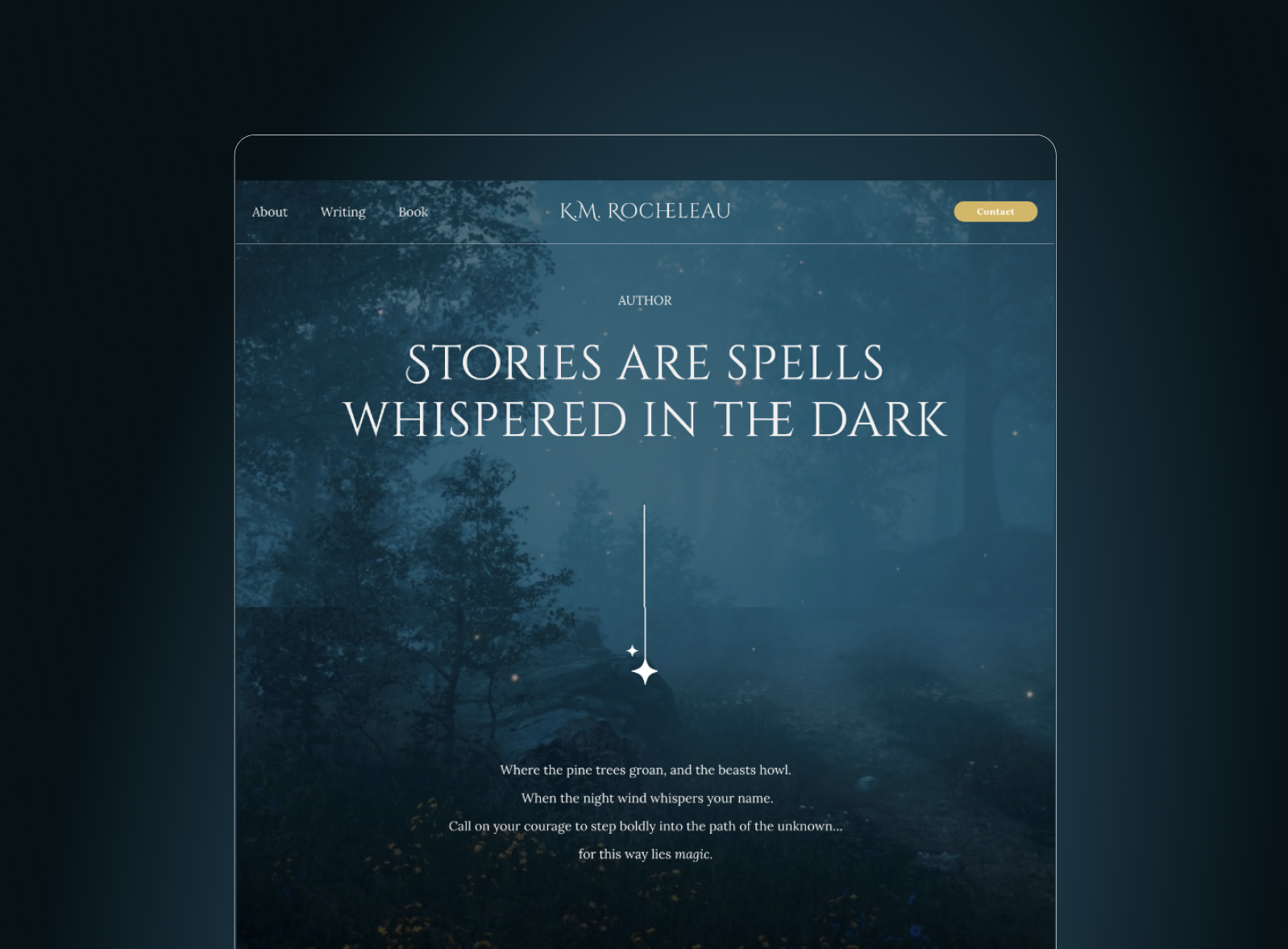
K.M. Rocheleau: The Atmospheric Gateway
The moment you land on K.M. Rocheleau's site, something shifts.
Not because of the color palette. Not because the typography is beautiful (it is). Because the copy does something most author websites refuse to do. It puts the reader inside the story before the book is even mentioned.
"Where the pine trees groan and midnight beasts howl."
That's not a tagline. That's a spell.
The site describes her as a "shadow-walker. story weaver." Two words. No bio. No resume. The brand does the work.
What it teaches you: Your "About" section is not your LinkedIn. It's your origin myth.
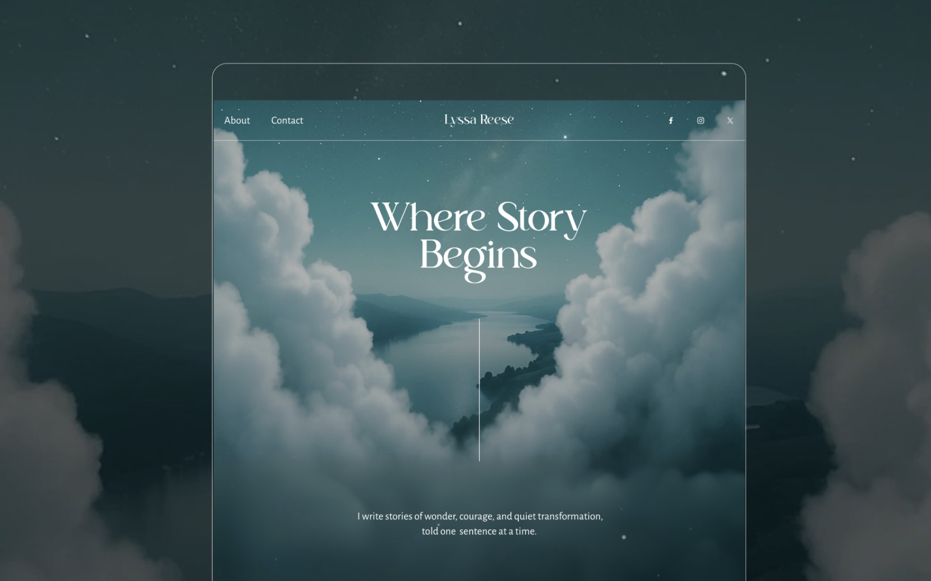
Lyssa Reese: The Reader-First Experience
Lyssa Reese's site opens on clouds.
Not decoration. Memory.
She grew up in Seattle. The fog wasn't atmosphere. It was home. The feeling of disappearing into something larger than yourself. That's what her homepage holds. Clouds that swallow the horizon. And behind them, barely visible, Hawaii.
Two places. One emotional truth.
"Where Story Begins."
That tagline doesn't describe a book. It describes a person. Someone who has always lived between worlds. Between fog and warmth. Between disappearing and arriving.
What it teaches you: The most powerful visual on your author site isn't the one that looks the most "fantasy." It's the one that is most true. Readers feel the difference.
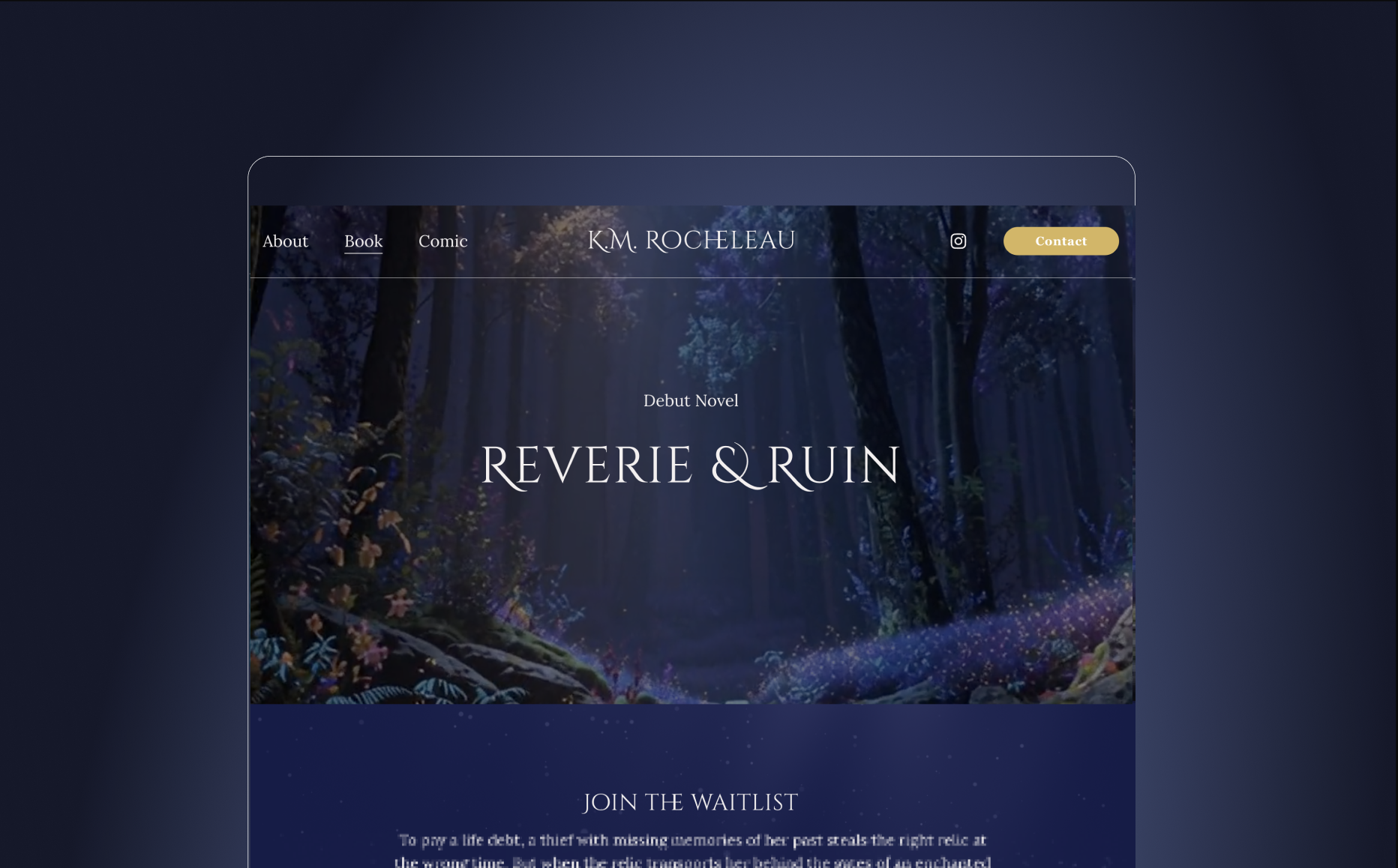
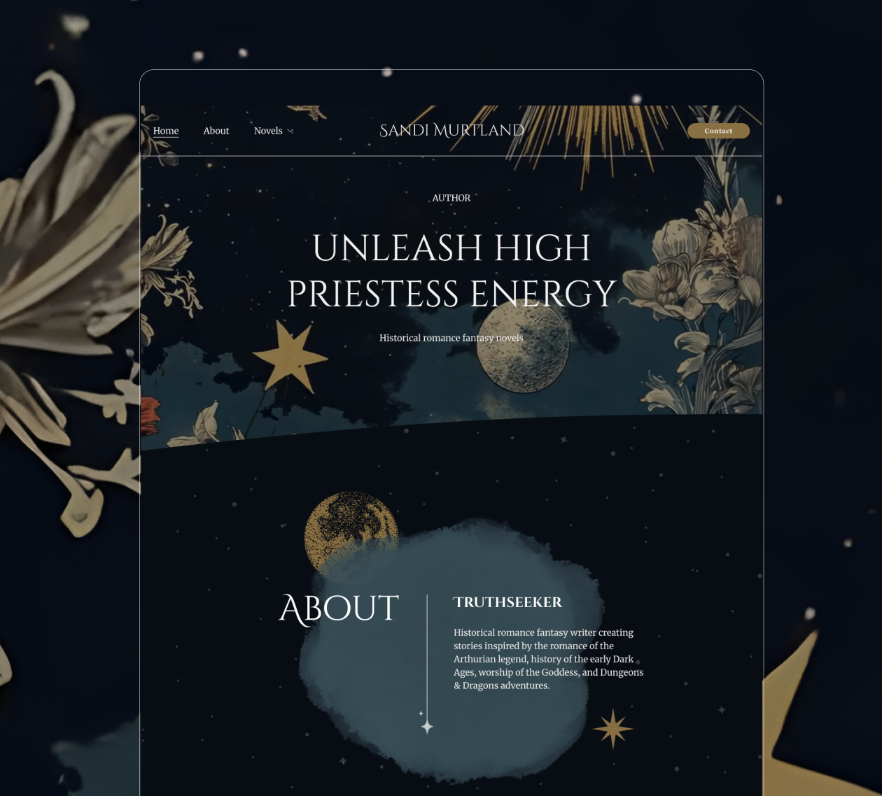
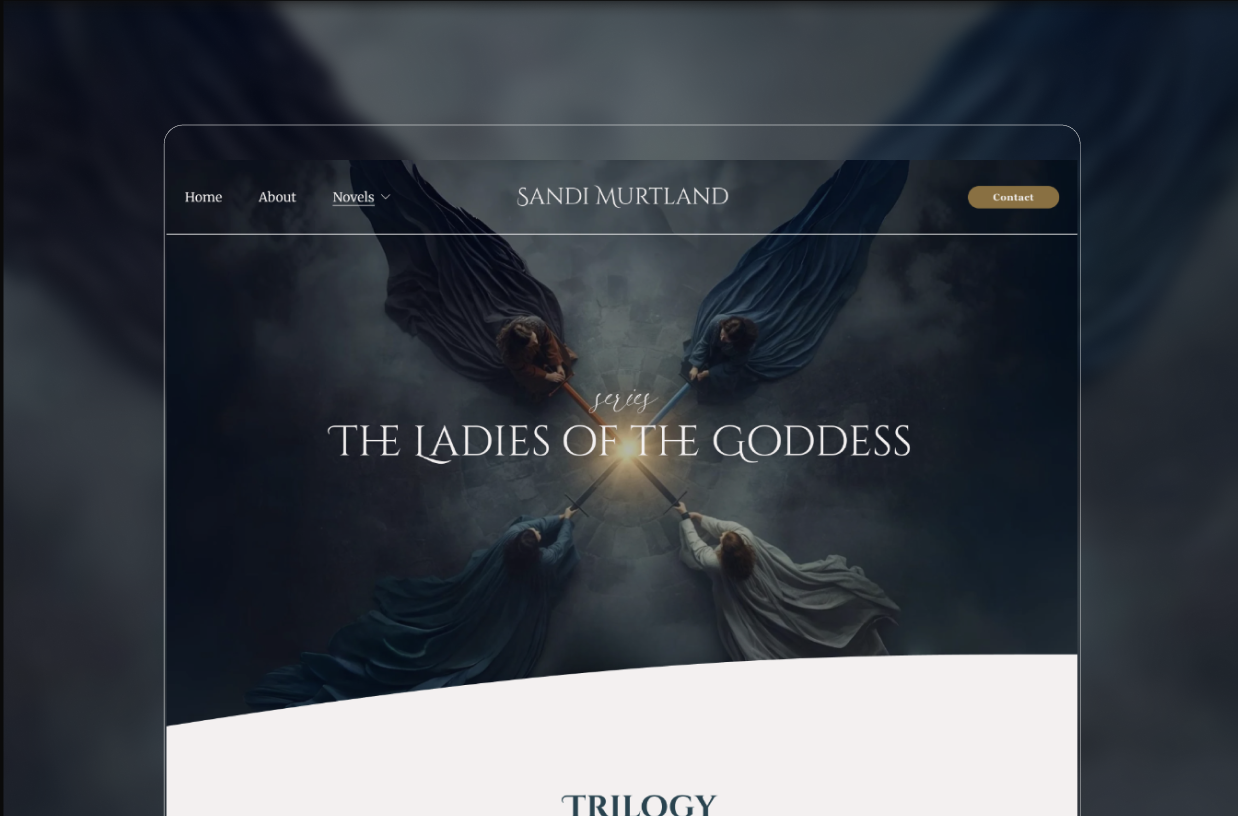
Sandi Murtland: The High Priestess World
Every author works with gets two things.
An author brand. And a book brand.
They're not the same. They're not supposed to be.
Sandi Murtland's author site leads with "Unleash High Priestess Energy." Gold, celestial illustration, deep teal. It tells you who she is before you've chosen a book.
Her book page for "The Ladies of the Goddess" goes darker. A goddess rising from shadow. Charcoal and indigo. Specific. Cinematic. Built for that story's reader.
One sells the author. One sells the world.
What it teaches you: When these two things look like the same template, the brand collapses. When they're built as a system, they do double the work.
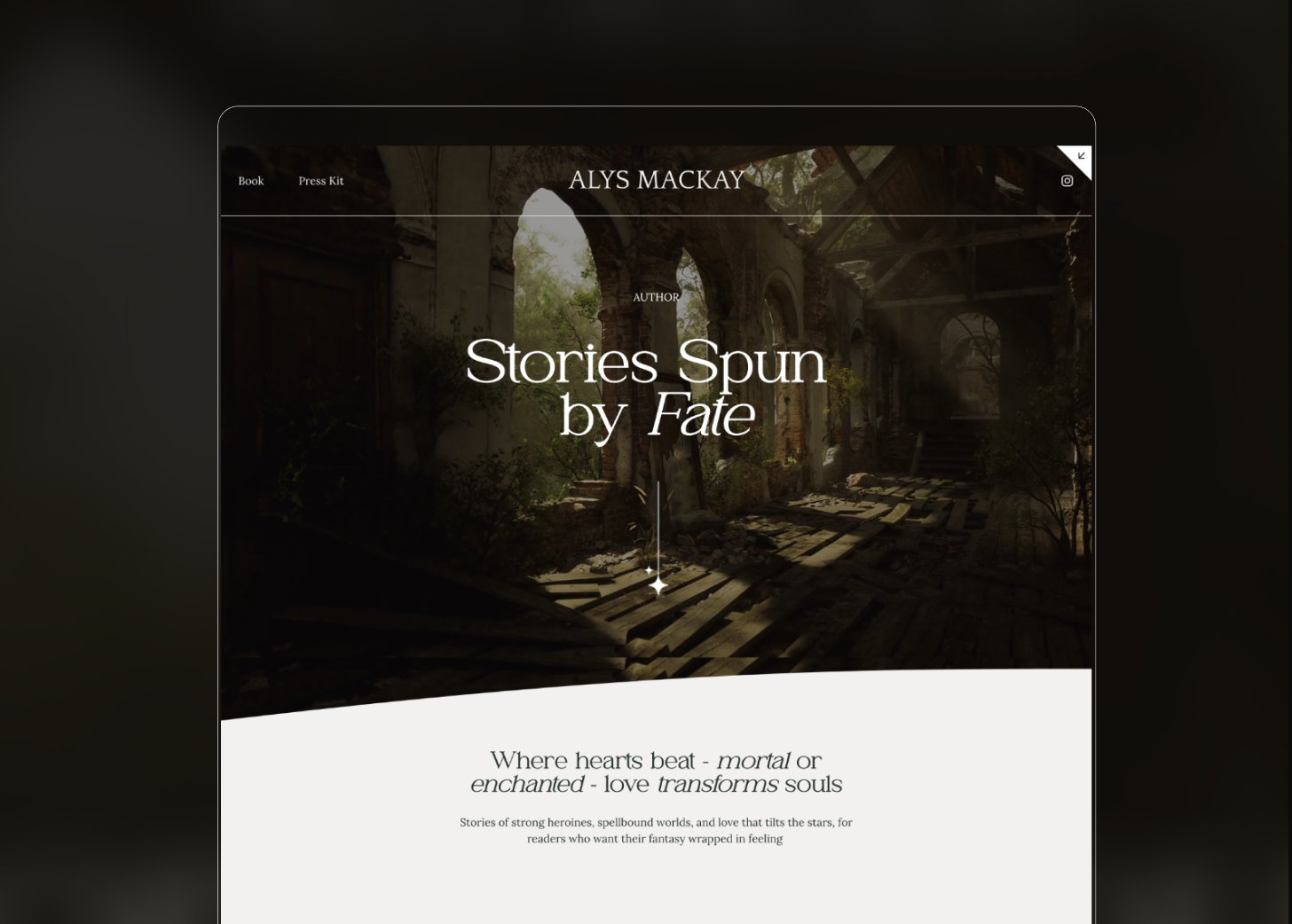
Alys Mackay: The Immersive Reader Gateway
Alys Mackay's author site opens on a single line: "Stories Spun by Fate."
No genre label. No book title. A ruined stone corridor with light cutting through the end. The reader leans forward before they've clicked anything.
That's the author brand. It sells who she is.
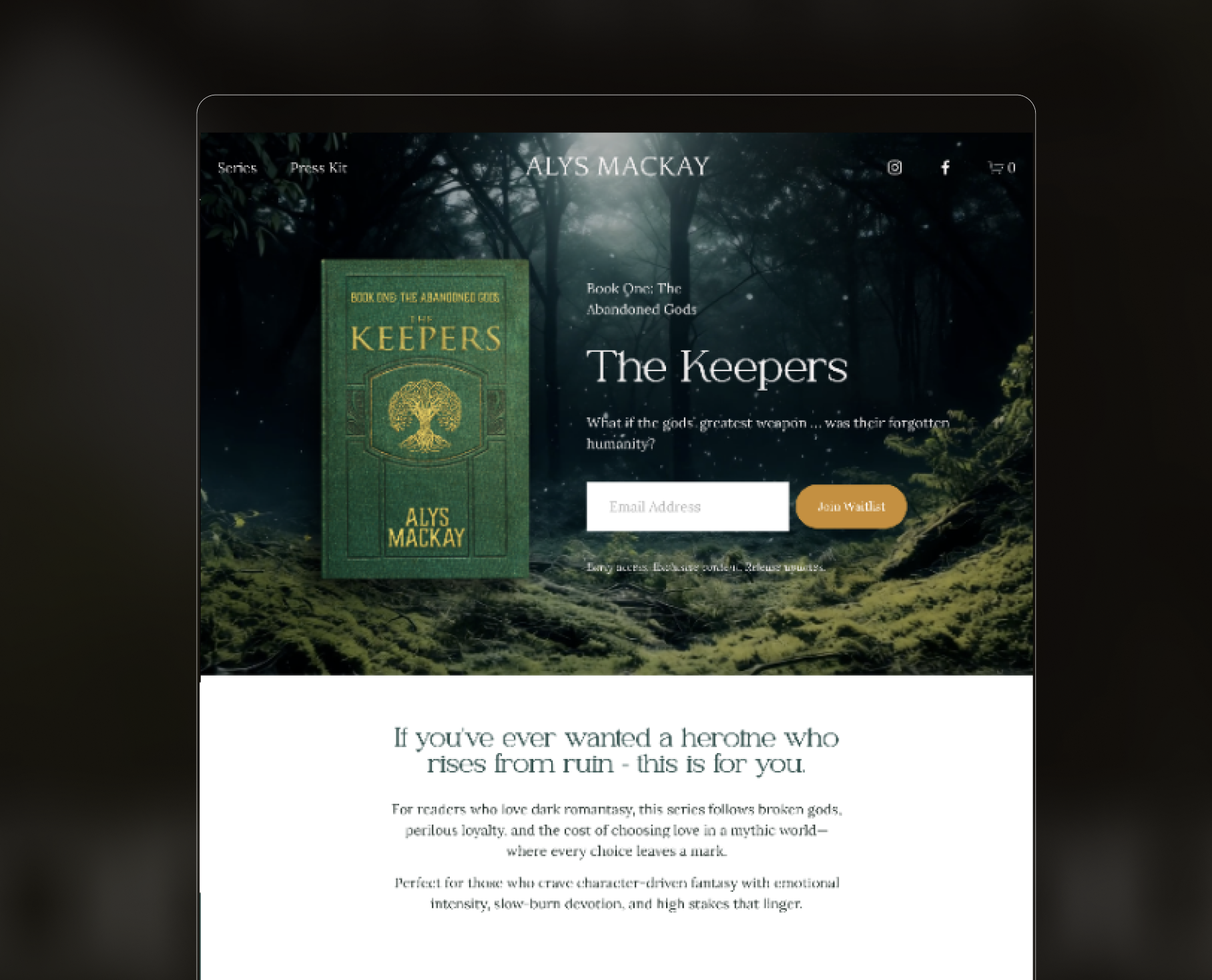
Her book page for "The Keepers" does something different. The forest goes dark and ancient. A moss-covered world. The book cover floats beside one question:
"What if the gods' greatest weapon... was their forgotten humanity?"
Then a waitlist form. Immediately.
No scrolling required to commit. The emotional hook and the conversion point live on the same screen.
What it teaches you: The author site earns the trust. The book site captures it. When both are built as a system, the reader moves from curious to subscribed without friction.
The Pattern Across All Four
These four sites have nothing obvious in common visually.
But structurally they all do the same thing.
They skip the introduction.
They create atmosphere before context. They make the reader feel before they think. They treat the homepage as emotional real estate, not informational real estate.
That's the standard fantasy readers now expect. A generic template is no longer neutral. It's a signal. It tells the reader this author doesn't know their own world well enough to show it to you.
The best fantasy author websites don't describe the book. They are the book.
Want a website that works this hard for your story?